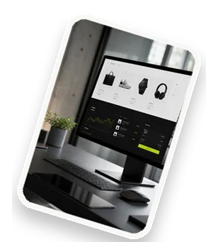
Dashboard and reporting solutions are powerful tools that transform raw data into actionable insights through visualizations, charts, and real-time updates. They enable businesses to monitor key performance indicators (KPIs), track progress, and make data-driven decisions quickly. By aggregating data from multiple sources, these solutions provide a single source of truth for organizations, enhancing transparency and efficiency. Whether you need to track sales performance, website analytics, or operational metrics, a well-designed dashboard can simplify complexity and accelerate decision-making.
What Are Dashboard and Reporting Solutions?
Dashboard and reporting solutions are integrated platforms that collect, process, and display data from various sources in a visually intuitive format. Core components include data connectors, visualization widgets (like bar charts, line graphs, and heat maps), and interactive filters. These systems aggregate data from databases, APIs, spreadsheets, and cloud services, enabling real-time monitoring and historical analysis. For example, a marketing team can combine data from Google Analytics, CRM, and social media platforms to view campaign performance at a glance. Dashboards often feature drill-down capabilities, allowing users to explore underlying details. Reporting solutions extend this by generating scheduled or on-demand reports with structured layouts, summaries, and export options. Together, they form the backbone of modern business intelligence (BI), empowering teams to spot trends, identify anomalies, and communicate insights effectively.
Key Benefits of Fast and Clear Dashboards
Fast and clear dashboards deliver numerous advantages that directly impact business performance. Improved decision-making is paramount: real-time data access allows managers to react instantly to changes, such as adjusting inventory levels based on sales spikes. Enhanced data visibility breaks down silos, giving every department a transparent view of shared goals. Automated reporting saves hours previously spent on manual data compilation, reducing errors and freeing up time for analysis. For instance, a retail chain can use a dashboard to monitor store-wise sales, inventory turnover, and customer footfall in one place, enabling swift strategic adjustments. Additionally, clear visualizations make it easier to communicate complex data to stakeholders, fostering alignment and faster consensus. The result is a more agile, informed organization that can capitalize on opportunities and mitigate risks proactively.
Essential Features of Manageable Reporting Tools
To be truly manageable, reporting tools must combine ease of use with robust capabilities. A user-friendly interface with drag-and-drop customization allows non-technical users to build reports without coding. Scalability is critical: the tool should handle growing data volumes without performance degradation, supporting thousands of users and millions of rows. Integration capabilities are equally important—seamless connections to databases (SQL, NoSQL), cloud services (AWS, Azure), and business applications (Salesforce, HubSpot) ensure data consistency. Other essential features include role-based access controls to protect sensitive data, automated scheduling for recurring reports, and export options (PDF, Excel, CSV). For example, a financial team might need to generate quarterly reports automatically, with drill-down to transaction-level details. Alerts and notifications can also be configured to flag outliers or threshold breaches, turning reports into proactive monitoring tools.
How to Choose the Right Dashboard Solution
Selecting the right dashboard solution requires a structured approach. Start by identifying your business needs and key metrics: what questions do you need to answer? For instance, an e-commerce company might focus on conversion rates, average order value, and customer acquisition cost. Next, evaluate data source compatibility—ensure the tool can connect to your existing systems, such as ERP, CRM, or marketing automation platforms. Consider user roles and access controls: different teams may need different views and permissions. A scalable solution can grow with your business, so assess pricing models (per user, per data volume) and future needs. Also, test the learning curve: a tool with a steep learning curve may hinder adoption. Finally, look for vendor support, community resources, and update frequency. For example, a mid-size logistics firm might choose Tableau for its advanced analytics or Power BI for Microsoft integration, while a startup might prefer Google Data Studio for its cost-effectiveness and simplicity.
Best Practices for Dashboard Design
Effective dashboard design follows principles that maximize clarity and impact. Keep it simple: focus on the most critical KPIs and avoid clutter. Use visual hierarchy to guide the eye—place the most important metric at the top-left (where reading starts) and use consistent color schemes (e.g., green for positive trends, red for negative). Ensure mobile responsiveness so dashboards are accessible on any device. Interactive elements like filters and drill-downs empower users to explore data without overwhelming them. Also, choose the right chart type: bar charts for comparisons, line charts for trends, and pie charts for proportions (sparingly). Provide context with benchmarks, targets, or historical averages. For example, a sales dashboard might show monthly revenue as a bar chart with a target line, plus a table of top-performing products. Regularly review and update dashboards based on user feedback to keep them relevant and actionable.
Common Challenges and How to Overcome Them
Implementing dashboard and reporting solutions comes with hurdles. Data accuracy and consistency are top concerns—disparate data sources may have mismatched definitions or missing values. Overcome this by establishing data governance policies, standardizing formats, and using data cleaning tools. Performance lag with large datasets can frustrate users; optimize by using data aggregation, caching, or in-memory processing. Another challenge is user adoption: employees may resist new tools due to lack of training or perceived complexity. Address this by offering hands-on workshops, creating intuitive interfaces, and highlighting quick wins. For example, a manufacturing company facing slow dashboards might implement a data warehouse with indexing, while training sessions could demonstrate how the dashboard reduces reporting time from hours to minutes. Regular feedback loops help fine-tune the solution and ensure it meets evolving needs.
Future Trends in Dashboard and Reporting
The landscape of dashboard and reporting is evolving rapidly. AI-powered insights and predictive analytics are becoming mainstream, with tools that automatically surface trends, anomalies, and forecasts. For instance, a dashboard might predict customer churn based on behavior patterns. Embedded analytics are also on the rise, integrating dashboards directly into business applications like Salesforce or Slack, so users access insights without switching contexts. Natural language query (NLQ) interfaces allow users to ask questions in plain English (e.g., "Show sales by region last quarter") and receive instant visualizations. Augmented analytics, which automates data preparation and insight generation, will further democratize data access. Real-time streaming data from IoT devices and social media feeds will enable live dashboards for industries like logistics and finance. These trends promise to make dashboards more intelligent, accessible, and actionable.
Get Started with Your Dashboard Solution Today
Ready to transform your data into a competitive advantage? Start by assessing your current reporting gaps: what information is missing or hard to access? Identify key stakeholders and their needs. Then, request a demo or trial of top solutions like Tableau, Power BI, or Google Data Studio to evaluate fit. Our experts at Devantum can help you design and implement a tailored dashboard solution that aligns with your business goals. We offer personalized advice, from selecting the right tool to customizing dashboards for maximum impact. Contact us today for a free consultation and take the first step toward faster, clearer decision-making. Let’s build a dashboard that works for you.